
When it comes to colour, the world of digital screens and printed media is far more complex than people realise. Whether you’re intending to show an image as a PDI (projected digital image) or a physical print, it is crucial to understand the differences between the colours you see on your monitor and the colours that appear on paper. These differences are due to the ways in which colours are created, processed, and displayed in each medium. Understanding these will help you produce prints that match what you see on screen as best as possible.

How do colours differ on screen and in print?
The most fundamental difference between monitor colour and print colour is the colour models used by each. This brings us on to RGB vs CMYK.
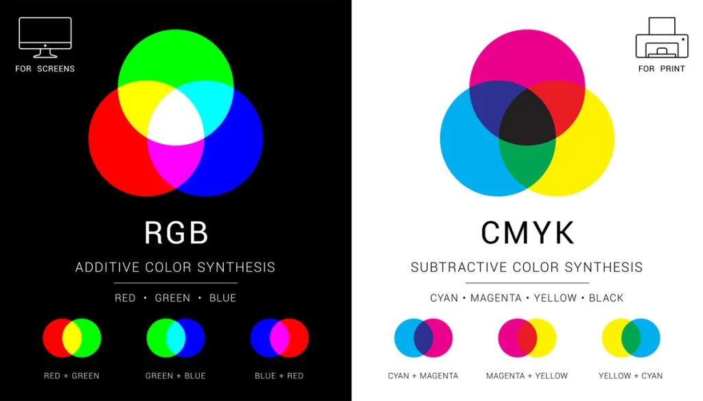
Screen = RGB (Red, Green, Blue)
RGB is the colour model used by digital screens, such as computer monitors, smartphones, and TVs. RGB works by mixing different intensities of red, green, and blue light to create colours. The more light you add, the brighter and more vibrant the colour appears. In the RGB model, the colours are created by the light emitted directly from the screen. When all three colours are combined at their highest intensity (255 for each), they create pure white. When all are at zero, the result is black.
Because RGB is based on light, it can produce bright, neon-like colours, especially those in the blue-green range. This is why colours on a screen often appear more vivid and saturated than printed colours.
Print = CMYK (Cyan, Magenta, Yellow, Black)
CMYK is the colour model used in printing. It works by subtracting light from the white paper using different ink colours that are mixed together to produce the final colour. Unlike RGB, which adds light to create colours, CMYK removes light. When all four inks are used in equal amounts, the result is near black. When no ink is used, the result is white, the colour of the paper.
CMYK has a more limited gamut and can’t reproduce the same range of colours as RGB. While it can produce rich, deep tones like reds and greens, it struggles with certain hues, especially bright cyan or neon colours. Some colours that look great on a screen may be impossible to reproduce accurately with ink, leading to dull or off-tone prints.
Colour seen from a screen vs printed
One of the biggest factors influencing how you perceive colour is light. Light can either be emitted from a source point or reflected off an object.
A screen is ’emissive’ which means it generates its own light and is therefore able to produce brighter colours. In contrast, prints are viewed through ‘reflected’ light which means they rely on the surrounding light sources. Consequently, an inkjet print will ALWAYS appear darker than the image seen on screen. This is because you are comparing an overly bright ‘emissive’ light with a ‘reflective’ light. It is not possible to print light, so you should always compare your prints to your screen with this in mind.
A print being viewed through reflected light also means the appearance of the colours can change depending on the lighting conditions. If the ambient lighting is, for example, generated by a tungsten bulb then the print will appear warmer.
Resolution and Dots Per Inch (DPI)
Another difference between monitors and print is resolution. Monitors display images with pixels, which are tiny units of colour that combine to form an image. The resolution of the monitor (measured in pixels per inch or PPI) determines how sharp the image looks. Higher resolutions allow for more detail, but there is still a limitation in how much colour information can be displayed at a time.
For printing, the quality of an image is often described in terms of DPI (dots per inch). A higher DPI means that the printer can place more ink dots per inch, resulting in sharper images with better colour accuracy. While monitors might display images at 72 to 300 PPI, a good quality print typically requires 300 DPI for the best results.
Why is my printer printing different colours than my screen?
There are various reasons why your prints may not match what you are seeing on screen.
- Printers and monitors are different devices, and their colour profiles don’t always match. As a result, you might see one colour on the screen, but the printed version might look entirely different. To ensure a closer match, calibrating your monitor is an essential step to ensure that what you are seeing before you send it to print is accurate.
- Printers also require a form of colour calibration called an ICC profile. This is a way of telling your printer exactly how it should reproduce the colours in your image depending on the type of paper and ink you are using. Find out more about ICC profiles.
- Consider the lighting you are viewing your prints in. Using a daylight viewing light is the best to way to assess your prints. It removes the influence of changing ambient lighting, giving you consistent results regardless of time of day or year.
- The type of paper or material used also affects the final colour output. Glossy papers will produce more vibrant colours, while a matt paper will result in a softer, less saturated look. Additionally, the paper’s texture can also influence how the ink sits on the surface, affecting how the colour appears. However, it’s worth remembering that the choice of paper is very personal as only the person whose image it is can say if the paper is right or wrong.
- Videos on how to calibrate your monitor, print profiling charts and how to upload paper profiles are freely available on the PermaJet YouTube channel.
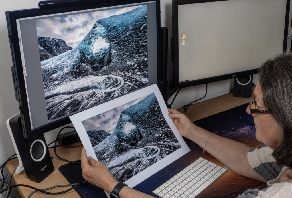
How to match your prints to your screen
You may be wondering how to match your prints to your screen. However, matching your print to be an exact replica of what you see on screen is never going to be possible due to the differences in lighting that we have discussed. Thankfully, there are ways to get as close a match as possible.
Step 1: Calibrate your monitor. Your monitor is the starting point in the chain so it’s important to make sure you are viewing accurate colours, otherwise there’ll be a knock-on effect on the rest of your print process.
Step 2: Use printer ICC profiles. PermaJet offer both generic and custom ICC profiles to help you get the best results on our paper. Using these will tell your printer how to reproduce the colours in your images as best as possible on paper.
Step 3: Choose the right paper. Using high-quality inkjet paper will help you get the best prints. Consider a paper that will enhance your particular images through surface texture or base tint.
Step 4: Soft proofing in Photoshop or Lightroom. Soft proofing is a popular way of checking if the image on screen will print accurately without wasting paper, ink and time. However, it isn’t always entirely accurate as the surface of the paper can’t be replicated on screen.
Troubleshooting: why is my printer printing too dark?
A common reason for a print looking too dark is that the monitor is set too bright. This can be particularly common for Mac screens which are notoriously bright. Whilst this can be great for viewing images and videos online, it will never be an ideal comparison to a print due to the difference with emissive and reflective light.
We always recommend reducing the brightness of your monitor when editing and printing images so that you’re not overcompensating for the brightness. The recommended industry standard is a Candela value of 120. If you calibrate your monitor this will help you to set it to a more suitable brightness.
Some people will also make specific edits to an image before printing it, for example bumping up the brightness +10, to compensate for the papers lack of emissive light. This is something that will require experimentation to achieve results you’re happy with.
Final thoughts
While digital and print colours are based on different colour models and have distinct characteristics, they are both crucial to the world of photography and printing. Understanding the differences between monitor colour and print colour is key to creating work that translates well across both media. Knowing how colours will appear in each medium will help you match your prints to your screen as best as possible. Always remember that colours on your screen might not look exactly the same on paper, and it’s recommended to do colour tests and proofs before finalising your work for print.
Key points to takeaway:
- Monitor colours will always be brighter than a print.
- The brightness of a monitor needs to be reduced to give the print a chance.
- There will always be a slight disparity between the colours produced on a monitor and those created in a print.
- Colour management is the key to getting the best results possible.
- Prints should always be viewed under ‘daylight’ lighting where possible.
By considering factors like colour profiles, resolution, paper type, and lighting, you can create visually stunning images that work in both digital and printed formats.
FAQ’s
What is the difference between print colour and screen colour?
A print is viewed with ‘reflected’ light and a screen is viewed with ‘emissive’ light. This means the colours you see on a print will be slightly darker and duller as it doesn’t have its own light source, whereas a screen will be bright, punchy and saturated due to it being a back-lit source. You should bear this in mind when trying to match your prints to your screen.
Why is my printer printing a different colour than on screen?
There are various reasons your printer could be printing a different colour to your screen, such as lack of monitor calibration, not using ICC profiles with your printer, having your screen too bright, and more.
Why do colours look different on screen vs. when they are printed?
A print on paper will never look exactly the same as the image on the screen due to the difference in light sources. However, there are steps you can follow to get as close a result as possible.